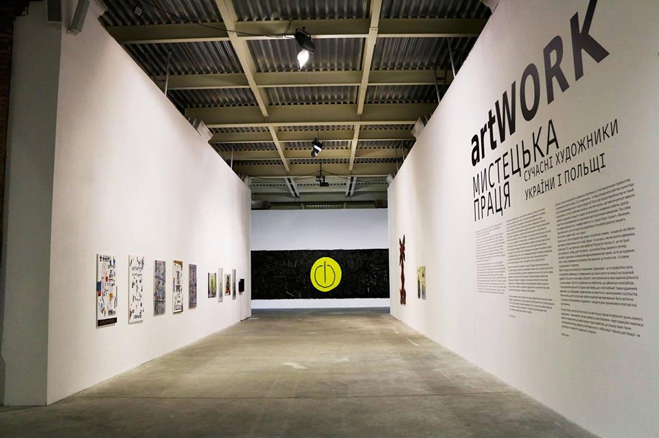
When it comes to the Arsenal, the first thing to remember is its sheer size — the place is enormous. It’s a bit of a job just to see the whole place in one sitting. But what is it like to create and ORGANIZE the entire space?
Everyone comes to see the artworks, but without the “organizing and guiding” work of the curators, none of this would be possible. Alisa Lozhkina, the Arsenal’s curator of contemporary art and and Eva Sulek, an independent curator from Wroclaw, Poland, coordinated this joint Ukrainian-Polish project, based on an original idea of Sulek’s.
To get a sense of the scale, let’s run some numbers: 12 thousand square meters ( in length alone), and the work of 60 artists – 34 Ukrainians and 26 Poles. It is a lot, a whole lot of everything.
That is, there’s a lot to see. And in large dimensions, as there’s plenty of space for both 2 and 3D work. Personally, I’m partial to the BIG, voluminous creations, There were two: one installation by Roman Mikhailov and one by Dasha Koltsova.
The “overview” begins – introducing the exposition via a large, oppressive video, which sets the tone, – “Work”, or rather “LABOR”! The video’s title, “Morok” (directed by Oleg Voronko) roughly translates as “darkness” and “trouble”. The video shows an unsettling black and white space, interrupted with creeping gray stripes and backed by a grinding sound.
There was a third large installation as well “Shaktar-Champion” — the work of Roman Minin, his already branded, recognizable style applied to the figure of the worker. Terrible, stern and mechanized, like in this American football, where the player is barely visible. I was even fortunate enough to meet the artist personally. Roman is positive, educated, and moreover, well-spoken — a rare enough feature among Ukrainian creatives.
You can not ignore the photos by Igor Gaidai and Arsen Savadov, already classics of Ukrainian contemporary art. Not made for this exhibition, it surprises (and pleases) that they were able function in a new context — a testament to the versatility of art.
Let’s return to Roman Mikhailov’s massive installation. There, in a large space, hang large falling sheets of fabric (very black and rough), there are a lot of these sheets, just fluttering. They are long, 7-8 meters, not less; There are hard to read inscriptions about something scratched on to them. I couldn’t help but recall the work of Christian Boltansky and Bach (foreboding, strong).
“Ridge” by Darya Koltsova, is built from different, all wooden frames, the supports that are used on the Andreevsky Descent to showcase “works of art” (is it bad to use air quotes?). But they truly are the backbone of fine art. Various “ribs” and “vertebrae,” in one place the frameworks even form the wing of a pterodactyl.
It seems like all the participants strove to go either with the topic of labor, or something else entirely.
Speaking of labor, suddenly a light-installation caught my eye, at the entrance to the left of Alexei Yalovega, placed atop shovels were various luminous vessels, into which had been put all kinds of instruments. They were, for some of us at least, enchanting.
What else was “great” or impressive? Or shall we take a detour? Next we encounter a transparent coffin with luminous borders, the “Capsule of Time” by Yaroslav Solop, into which it is possible to throw litter. It had already been filled. Also on the topic of pollution, there adjoined another no less impressive work of the trash art style, a huge photograph of waste, reminiscent of the sculptures of HA Schult — also made from waste.
We continue to classify: here is Victor Pokidanets’ painting “Brigade”, featuring real workers’-workers. They even have helmets, lest we doubt their bonafides. Essentially it’s a piece of well-meaning but silly post-socialist realism, glorifying work and workers — which exist in such small amounts today as to have nearly vanished from public opinion.
Their place has been taken by ІТ workers, which Yulia Belyaeva demonstrates to us, sculpting their figures on a 3D printer. But where is the creator then? And why are these sculptures so similar to our monuments, especially the heroic kinds? Sculptures should be sculptures and monuments should be monuments. Okay?
Next up is a billboard photo, which showcases a tractor and the slogan “Work is Exalting.’’, which sounds eerily like a well-known slogan for concentration camps. Adjoining is Janina Merzhely’s exhibition “Poland 1939”, with photos of many hands, calloused and dirty.
A video from another Polish author shows a person covering a surface with a roller (Katarzyna Gorny). Rafal Yakubovich presents a draft “vitryak”(mill) made of letters in a futuristic font.
A video where two Germans are ranting in German about arbeit made it into the exposition; and Ermin Rusichka demonstrated her hatred toward the Ministry of Culture (here I felt an acute sense of brotherhood with the Poles).
It appreciated the presence of Evgeny Chernyshov’s piece “Annual Report”, made from shell casings, as this is also Ukrainian work today.
Enough! It is impossible to describe everything! Though I can’t forget to mention the refreshingly straightforward video by Igor Gankevich, in which a shaven-headed man inhales and exhales through a pipe on a 5 second-loop to the chants of Bach. Perhaps an apt illustration of artist’s primary work — doing nothing.
But what is work, truly? Work broadly, is “practice”, or labour. Something one imagines the exhibition’s curators know a thing or two about. Making repeated 12 00 meter races across the Arsenal, sprinting about, arranging and organizing everything — this being a curator. And here I think they have artists beat. There’s a lot more to curating than simple creativity, it takes elbow grease.


